

-
After some thought I am not a fan of the script. The "s" looks like a backwards "&" and the school that I despise more than anything in the world has Script on their helmets and as if they are not annoying enough already, I can hear it now, "Lil brother had to copy us....."
-

Originally Posted by
Maroonthirteen

Back in the fall I was at maroon and company. They had plenty of MS baseball logo polos, T-shirt's and jerseys. None sold out and most on sale.
But hey.... if State fans want to create the narrative that all State fans hate their own logo, go ahead. That would be par for MSU. "Poor ole me trudging along with this god awful logo on my chest. If only we had leadership as smart as me, we'd win the national championship." Hahahaha.
I think you just proved what the original poster was saying. It's our best logo but it's not leveraged. I LOVE the MoverS used by baseball....but it's only marketed as a baseball logo. College baseball (while fun) is about the 4th-5th ranked sport in college. It just doesn't pull as many fans. I've been buying vintage styled t-shirts since the M-State logo came out to avoid that eye-sore.
-
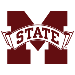
Not interested at all in the M over S. Seeing it confirms that in my mind. Hope we never do that.
But that "State" script is fire. 100. A+++ Hope we see that as an alternate helmet someday. Great job on that chill.
-
Originally Posted by
Turfdawg67
This is all that needs to be said. It's just another retread of a tired Shotgun opinion that he desperately brings up when he can't think of any other topic. (See: South Endzone)
Yeah, 63 replies based on only Shotgun wanting to talk about this.
CAN'T PUT A SADDLE ON A MUSTANG
Quit Your Bi$&$&?!, He's Not Going to Run the Ball More
-
Originally Posted by
Turfdawg67
I know I'm in the minority, but I don't mind the M-State one, but the first iteration was horrible. Luckily, I don't think it ever graced our helmets though.
vs.
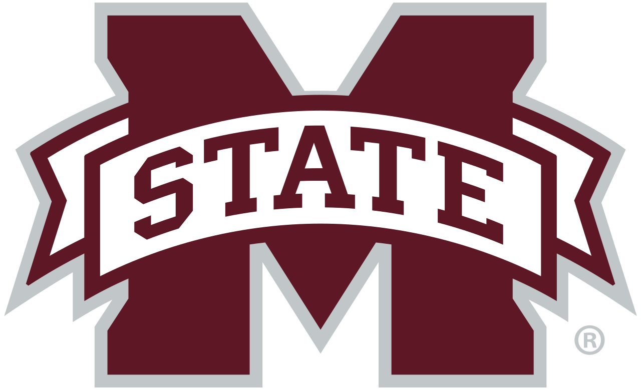
I think the M State is clean. I acknowledge it's not perfect for a helmet but it's a good logo. I can spot it a mile away now when I see it on a car or a shirt.
-
Originally Posted by
Turfdawg67
Opinions are like a-holes.
Everyone has one and most of them stink!
-
Originally Posted by
gtowndawg
I think the M State is clean. I acknowledge it's not perfect for a helmet but it's a good logo. I can spot it a mile away now when I see it on a car or a shirt.
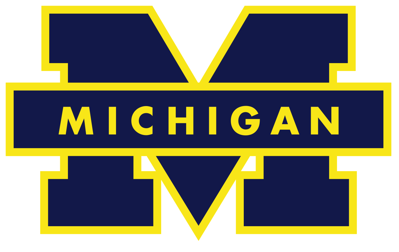
It's just too generic to me for a football helmet.
Imagine Michigan putting this on their helmet. You tell me what is better for branding?
CAN'T PUT A SADDLE ON A MUSTANG
Quit Your Bi$&$&?!, He's Not Going to Run the Ball More
-
We all want the M over S because we can’t have it. If it was our current logo, we would all be bitching wanting the banner M, it’s what we do.
-
yeah the current M State logo I think it solid and deserves a prominent place in University marketing. It's great for license plates, window stickers, letterhead, signs, etc. but to me just isn't a great sports logo outside maybe some basketball usage.
I guess I am surprised at two things:
1) How much everyone seems to dislike the block on the letter (I knew it wasn't great)
2) How many people dislike the baseball logo on the helmet since I think it looks awesome
I also don't disagree with trying to make "State" our thing in the southeast. That's a good idea and it's great to throw up on actual jerseys but while I like the helmet concept with State on it, to me it doesn't hold a candle to the M over S variant.
-
Originally Posted by
ShotgunDawg
Yeah, 63 replies based on only Shotgun wanting to talk about this.
Yep, 21 by you and now 6 by me... plus the obligatory response from C34 stating that the logo in his avatar is the best. That's about half of them right there. No one is denying you know how to keep a thread going. Reply with at least 1/3 of the responses, even if you are just repeating yourself, to keep the thread at the top.
But hey, with Scooba, Cadaver, Coach 34, Coach 007 and others MIA lately, I guess we need you Shotgun. (*pat on the back)
-
Originally Posted by
ShotgunDawg
I simply don't get it.
The M over S looks like a JV high school football helmet from the midwest. Thats why.
-
Originally Posted by
gtowndawg
Not interested at all in the M over S. Seeing it confirms that in my mind. Hope we never do that.
But that "State" script is fire. 100. A+++ Hope we see that as an alternate helmet someday. Great job on that chill.
Looks good form the right side of the helmet but how would State look from the left side trying to fit the capitol S in next to the facemask
-
Originally Posted by
Dawgology
I think you just proved what the original poster was saying. It's our best logo but it's not leveraged. I LOVE the MoverS used by baseball....but it's only marketed as a baseball logo. College baseball (while fun) is about the 4th-5th ranked sport in college. It just doesn't pull as many fans. I've been buying vintage styled t-shirts since the M-State logo came out to avoid that eye-sore.
It's marketing as a baseball logo because it is a quintessential baseball logo. see the the uniforms of the yankees, Mets etc etc.
College baseball is a very close 2nd fan favorite sport at MSU. See this thread.
Saying MS is the best logo is opinion. My opinion is that State fans like that logo because of the baseball history And the logo itself isn't that great. It's a simple baseball logo. Opinion.
-
Originally Posted by
Maroonthirteen
My opinion is that State fans like that logo because of the baseball history And the logo itself isn't that great. It's a simple baseball logo. Opinion.
This is where we disagree. I think the logo is sharp, crisp, & Timeless
CAN'T PUT A SADDLE ON A MUSTANG
Quit Your Bi$&$&?!, He's Not Going to Run the Ball More
-
Originally Posted by
Turfdawg67
Yep, 21 by you and now 6 by me... plus the obligatory response from C34 stating that the logo in his avatar is the best. That's about half of them right there. No one is denying you know how to keep a thread going. Reply with at least 1/3 of the responses, even if you are just repeating yourself, to keep the thread at the top.
But hey, with Scooba, Cadaver, Coach 34, Coach 007 and others MIA lately, I guess we need you Shotgun. (*pat on the back)
And Bert. He may be KIA though (hope not).
-
Originally Posted by
Offshore Dawg
Looks good form the right side of the helmet but how would State look from the left side trying to fit the capitol S in next to the facemask
I was wondering the same thing.
-
Originally Posted by
ShotgunDawg
Special thanks to Chillbilly for doing this. He completely knocked it out of the park.
These two helmets are better than anything we've ever worn at MSU IMO & I believe the M over S one has national brand potential.
Both of these are clean, sharp, unique, & MSU.
We'd be absolutely nuts to not begin mixing one or both of these. Significantly better than anything we've got.


The Stayte one is pretty damn good. The M over S looks like a baseball logo on a football helmet**
-
Originally Posted by
Irondawg
Let?s just ask the question like this. You get to go buy one piece of MSU gear (say a hat or tshirt) and you?ll wear it to every sport event for MSU. What logo are you choosing?
The answer should be tour main sports logo. I?m choosing a maroon baseball hat with the baseball logo hands down.
There are places the block logo looks good. I like the ?state? script as an alternative Helmet and the throwback basketball uniforms with just ?state? on them are my favorite.
The current helmets are not awful like the Croom era but they are pretty mediocre
I used the same thought process when designing this logo in honor of the Pirate. I just went with the best looking representation we have. Just like when I buy a hat. M over S every time whether I plan on wearing it to a football game or baseball game. Here are a few things I did.
Hailstate Map.jpg
State Life.jpg
Compass MS.jpg
-
I actually think the M state logo doesn't look bad as our official logo. I just think it looks horrible on a helmet. LSU, Florida, and Alabama don't wear their main logos on their helmets. I don't think it hurts their brand. The State script would be cool bc it would help establish us as "State" which I think most agree makes us unique.
-
Originally Posted by
KOdawg1
I actually think the M state logo doesn't look bad as our official logo. I just think it looks horrible on a helmet. LSU, Florida, and Alabama don't wear their main logos on their helmets. I don't think it hurts their brand. The State script would be cool bc it would help establish us as "State" which I think most agree makes us unique.
I think the majority of MSU fans agree with this post. Not all, but the majority. Good post.
 Posting Permissions
- You may not post new threads
- You may not post replies
- You may not post attachments
- You may not edit your posts
-
Forum Rules
Disclaimer: Elitedawgs is a privately owned and operated forum that is managed by alumni of Mississippi State University. This website is in no way affiliated with the Mississippi State University, The Southeastern Conference (SEC) or the National Collegiate Athletic Association (NCAA). The views and opinions expressed herein are strictly those of the post author and may not reflect the views of other members of this forum or elitedawgs.com. The interactive nature of the elitedawgs.com forums makes it impossible for elitedawgs.com to assume responsibility for any of the content posted at this site. Ideas, thoughts, suggestion, comments, opinions, advice and observations made by participants at elitedawgs.com are not endorsed by elitedawgs.com
Elitedawgs: A Mississippi State Fan Forum, Mississippi State Football, Mississippi State Basketball, Mississippi State Baseball, Mississippi State Athletics. Mississippi State message board.


 Reply With Quote
/cdn0.vox-cdn.com/uploads/chorus_asset/file/4179066/PUNTER.0.0.gif)


