
-

Originally Posted by
yjnkdawg

JMO but I think pinstripes would ruin the intent and look of the helmet. We don't have pinstripes on our Maroon MS Baseball caps.
Sorry pinstripes were a joke on the planned baseball theme
-
Multiple final 4s, #1 ranking, most successful decade in men's and women's basketball and football have all occurred under the MState logo.
However .... hate away State fans. Long for some Diagonal letters. That's imaginative.**
MoverS is a quintessential baseball logo.
Last edited by Maroonthirteen; 10-26-2021 at 10:44 PM.
-
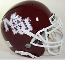
The Banner Logo is an embarrassment. I don't care what we put on the helmet as long as it isn't that banner logo that looks like a butterfly on the side of the helmet unless it's a close up shot. We need to embrace "State" on the jerseys, and any logo other than the banner. MoverS, STATE, Flying M, diagonal MSU...hell id rather see us with a plain helmet than the banner.
-

Originally Posted by
CadaverDawg

The Banner Logo is an embarrassment. I don't care what we put on the helmet as long as it isn't that banner logo that looks like a butterfly on the side of the helmet unless it's a close up shot. We need to embrace "State" on the jerseys, and any logo other than the banner. MoverS, STATE, Flying M, diagonal MSU...hell id rather see us with a plain helmet than the banner.
This all day. It looks weak and submissive. Almost like something you see in a church.
It's michigan's "m" with state written across it. We need to get rid of it
-
To any Banner M apologists, the A in state isn't is not centered and that's how much attention was paid when we chose this logo.
-

Originally Posted by
CadaverDawg

The Banner Logo is an embarrassment. I don't care what we put on the helmet as long as it isn't that banner logo that looks like a butterfly on the side of the helmet unless it's a close up shot. We need to embrace "State" on the jerseys, and any logo other than the banner. MoverS, STATE, Flying M, diagonal MSU...hell id rather see us with a plain helmet than the banner.
I've never thought about it but it sure does look like a damn butterfly. That's embarrassing.
-
I get the university has poured money into marketing with the Banner Mstate, but at what point do they listen to fans and it seems a majority do not like it. They could kill it on merchandise alone with using the other logos. Heck, rotate the Flying M, State, MoverS, or merge the Flying M as M over S. Anything but the Banner Mstate.
Is this a generational thing that certain age groups like Banner Mstate, and that is who the university is insulated into listening to?
-
The best uniform we ever had football wise was the Salute to the MS Air Guard uniforms. Maybe embrace the military more often and become known as a military loving school as well as Agriculture. But like some have said the diagonal MSU helmets looked good as well.
-

Originally Posted by
Tater

To any Banner M apologists, the A in state isn't is not centered .
Speaking of not centered.....you stated the current living conditions of a modern day college athlete was equal to that of a serf. gezzzz.
-

Originally Posted by
Santiago

I get the university has poured money into marketing with the Banner Mstate, but at what point do they listen to fans and it seems a majority do not like it. ?
The opinions of this message board isn't the majority.
-
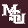
Any form of the diagonal MSU is fine with me. I personally like the late 80s early 90s version as on my avatar. But I like any of them over the banner
-

Originally Posted by
CadaverDawg

The Banner Logo is an embarrassment. I don't care what we put on the helmet as long as it isn't that banner logo that looks like a butterfly on the side of the helmet unless it's a close up shot. We need to embrace "State" on the jerseys, and any logo other than the banner. MoverS, STATE, Flying M, diagonal MSU...hell id rather see us with a plain helmet than the banner.
THIS THIS RIGHT HERE! I have been trying to figure out what it looks like and a freaking butterfly! That is perfect!
-

Originally Posted by
Maroonthirteen

The opinions of this message board isn't the majority.
The opinions on this message board are squarely in line with a majority of our fanbase in the 40-60 age range. I dont know anybody personally that likes the banner logo. Never met anybody that calls us "M-State". We are called "State" or "MSU". Our helmet should reflect that. The interlocking MSU in my avatar plus using the script State on the helmet from time to time is where we need to be. It would be overwhelmingly popular
Walk like the King or walk like you don't care who the King is
-
Same. None of my large family and group of State friends like the banner. In fact, most of our apparel now consists of The Vault collection released
-
One big point of the MState logo is to market "State." I don't hear people call us MSU any longer. It is always State and on rare occasion Mississippi State.
With that said, I'm of the "MSU" logo generation. I like the various forms of that logo. However, to me it represents the 80s and 90s. I am of the opinion the MState logo is a good logo and represents the new era, winning in football and basketball, Final 4s and #1s.
Also, I go to games, tailgates and dinners and hang out around town. I never hear anyone complain about the MState logo. I see people wearing it everywhere and see businesses use it (when they don't have to). The complains of the MState logo is just message board fodder.
-
Again… MoverS should be our logo. On everything
-

Originally Posted by
Maroonthirteen

Speaking of not centered.....you stated the current living conditions of a modern day college athlete was equal to that of a serf. gezzzz.
Is it really necessary to inject politics into a completely irrelevant thread that has 0 to do with politics?
-

Originally Posted by
Tater

Is it really necessary to inject politics into a completely irrelevant thread that has 0 to do with politics?
Drop it. Just ignore the comment.
-
I'm interested to see what they'll do with the field this week. I could see us going M over S on the 50 and maybe doing the national champs logo somewhere else on the field.
-

Originally Posted by
Coach34

The opinions on this message board are squarely in line with a majority of our fanbase in the 40-60 age range. I dont know anybody personally that likes the banner logo. Never met anybody that calls us "M-State". We are called "State" or "MSU". Our helmet should reflect that. The interlocking MSU in my avatar plus using the script State on the helmet from time to time is where we need to be. It would be overwhelmingly popular
This, this all day! State or MSU needs to be us, I hardly ever say Mississippi State, I am to lazy and sometimes find myself saying middatippy tate instead just to be funny. I always say State I think that should be our marketing call and our Banner should be a mixture of State, Bulldogs, or MSU. The only other program that we would have to beat out on this is Michigan State, and if we just upped our marketing and owned that mess, we could take it over. Nothing on the Hailstate store is sold in any of those designs, I finally broke down and bought a pullover sweatshirt with bulldogs on it, but they HAD to include the stupid banner at the bottom. I wish that it just said bulldogs, or State, or MSU. That stupid banner is stupid and looks childish.
Edit: You could even go back to the 90's and put the Miss. State on or jerseys, I don't mind that at all. A&M changed to that last year or this year, it is kinda retro, but it looks good and clean.
Edit 2: Here in Alabama EVERYONE refers to us as State or Bulldogs. Take it, own it, use it, brand it, I bet most of the SEC we are known as State or the Bulldogs, so the knowledge is there, just brand that mess already!
Last edited by Maverick91; 10-27-2021 at 12:03 PM.
 Posting Permissions
- You may not post new threads
- You may not post replies
- You may not post attachments
- You may not edit your posts
-
Forum Rules
Disclaimer: Elitedawgs is a privately owned and operated forum that is managed by alumni of Mississippi State University. This website is in no way affiliated with the Mississippi State University, The Southeastern Conference (SEC) or the National Collegiate Athletic Association (NCAA). The views and opinions expressed herein are strictly those of the post author and may not reflect the views of other members of this forum or elitedawgs.com. The interactive nature of the elitedawgs.com forums makes it impossible for elitedawgs.com to assume responsibility for any of the content posted at this site. Ideas, thoughts, suggestion, comments, opinions, advice and observations made by participants at elitedawgs.com are not endorsed by elitedawgs.com
Elitedawgs: A Mississippi State Fan Forum, Mississippi State Football, Mississippi State Basketball, Mississippi State Baseball, Mississippi State Athletics. Mississippi State message board.






 Reply With Quote


