View Poll Results: Which helmet lookss better?
- Voters
- 157. You may not vote on this poll
-
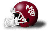
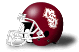
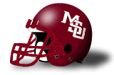
Interlocking MSU
-
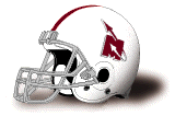
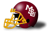
M-State helmet


-
New era. Better football program. -> Banner M
Wish we would do a throwback game with the Rocket M.
-
Member

Nike also licensed that logo to Midwestern State University, a DII school in Texas, at the same time that we were using it.
http://nationalchamps.net/Helmet_Project/lonestar.htm
"Man was made improvable, not perfect, so Strive for the Highest." James C. Floyd
-

Originally Posted by
BHildreth3

I think this one looks awesome

Although I like M-State, this one would be nice. Hasn't it been said the interlocking is tied up with Nike or someone? So it's not even an option?
Never mind.....I see other thread.
Last edited by Dawgface; 01-04-2018 at 02:29 PM.
-
Member
Last edited by HossDawg97; 01-04-2018 at 02:33 PM.
"Man was made improvable, not perfect, so Strive for the Highest." James C. Floyd
-
Originally Posted by
BHildreth3
I think this one looks awesome
LOL I just put the interlocking percentage over 61%. I have always liked the 1999 helmets, but the one above I really like too. I know that many people like the M-State one, and everybody has their own opinions, but I have just always liked those Jackie helmets.
-
Originally Posted by
BHildreth3
I think this one looks awesome
That is by far my most favorite. Sure wish we could get it back!
You're blind if you can't see improvement.....Freshmens......Strain.....Kick rocks and pound sand......Drag my Yankee ass outta here!......
-
Not letting me post a pic, but I like this one we used from 1986-95.
http://www.sportslogos.net/logos/vie...6/Primary_Logo
-
Does the J=junction or jive in the MSJ emblem
-
Originally Posted by
BHildreth3
I think this one looks awesome
This is an awesome looking helmet.
-
Personally I wish we could use the Baseball logo on our helmets. Love the MSU baseball logo
-
Hey guys. I have been reading for years. I decided to create an account for this thread. I have a helmet from the late 80s when Felker was coach. It was the best in my opinion. It looks almost exactly like the one Chilly Billy mocked up. I will post a pic of it when I get off work.
-
Banned
I like the old baseball uniform pinstripe with just State on it as a good retro look...too bad you can’t do helmets like that.
-
If you a holes were half as passionate about MBB as you are about helmet logos, I wouldn't have to watch our team play to a mostly empty arena. It really looks bad on my new HDTV.*****
-
Originally Posted by
Turfdawg67
Interesting...

Beautiful!
Originally Posted by
HoopsDawg
MState logo can be the brand, but it doesn't have to go on the helmet. Bama has numbers on their helmet. Penn State has a blank helmet. You sound like a consultant when you say that.
Not a consultant, but married to someone who has a masters in Sports Marketing so I've been exposed to that kind of talk a whole bunch.
WHY IS EVERYONE YELLING?!?
-
-
Come on MStaters. Let?s take the lead!
The only critique of the MState logo is that it needs to be a larger on the helmet. About the size of Wisconsin?s W. Or the Missouri M from a few years ago.
Speaking of Wisc, if you just wanted to go with a new look for a new era, I wouldn?t mind a helmet just like Wisconsin?s. White with maroon face mask and Large maroon MState with two maroon stripes.
-
Originally Posted by
Prediction? Pain.
Need more options:
1963 - 1965
 1966
1966
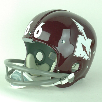 1969 - 1971
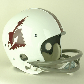
If nothing else, those bad boys warrant inclusion on some throwback uniforms here and there.
Between the interlocking and M-State, I'm torn. I've always thought that the M-State looked way too much like Michigan's mark. But I've also gotten used to it and associate it with modern MSU football, along with the new bulldog logos. The interlocking logo is great -- though I'm not sure which iteration I prefer -- and I associate it directly with the first decade of my MSU fandom. But, at least for me, it's a tad dated in a way that's not as appealing as some of the older logos I posted above.
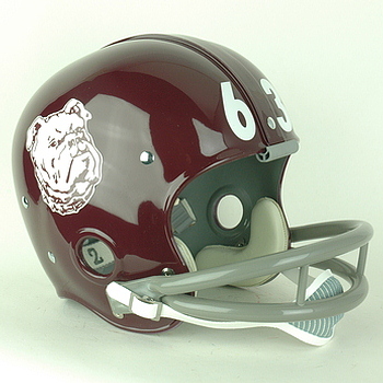
That Bulldog logo is badass lets do that one
-
Hard to believe it’s this close. Got to be some OM trolls voting
Walk like the King or walk like you don't care who the King is
-
Originally Posted by
Coach34
Hard to believe it’s this close. Got to be some OM trolls voting
I think it's directly tied to when you attended school...just my opinion but there are sentimental ties to a logo. If you were in school during the interlocking times, chances are you feel a bit more fondly of it (and vice versa on the banner).
-
Originally Posted by
Coach34
Hard to believe it’s this close. Got to be some OM trolls voting
I think most people that prefer the M State like some of those uniforms from our run to #1. The people that love the MSJ think fondly of the run to the SEC Championship game and winning the West. I like the M State because it gives us better brand recognition. If you say MSU, most people not in the SEC think of Michigan State. The M State is shown whenever they show highlights of Dak or our run to #1. That trumps all of those other games to me.
 Posting Permissions
- You may not post new threads
- You may not post replies
- You may not post attachments
- You may not edit your posts
-
Forum Rules
Disclaimer: Elitedawgs is a privately owned and operated forum that is managed by alumni of Mississippi State University. This website is in no way affiliated with the Mississippi State University, The Southeastern Conference (SEC) or the National Collegiate Athletic Association (NCAA). The views and opinions expressed herein are strictly those of the post author and may not reflect the views of other members of this forum or elitedawgs.com. The interactive nature of the elitedawgs.com forums makes it impossible for elitedawgs.com to assume responsibility for any of the content posted at this site. Ideas, thoughts, suggestion, comments, opinions, advice and observations made by participants at elitedawgs.com are not endorsed by elitedawgs.com
Elitedawgs: A Mississippi State Fan Forum, Mississippi State Football, Mississippi State Basketball, Mississippi State Baseball, Mississippi State Athletics. Mississippi State message board.


 Reply With Quote